


We’ll kick things off with a little browser history. Apartment Therapy was started in 2004, i.e. 100 years ago in Internet-years. Back then, it was one of the first online destinations for the design obsessed, pioneering the now-omnipresent scrollable House Tour and paving the way for countless other design blogs, magazines, and Instagram accounts. Back then, its founder, Maxwell, was an interior designer looking to connect with his clients about how their homes and how they could make them better reflect their lives and personalities.
Fast forward to now, and AT is one of the top design sites, having outlived and outperformed many of its followers. Though these days their coverage has expanded to real estate, organization, and wellness Maxwell’s original idea – how great design can make for a happier life at home – still reigns supreme. And now in his Hamptons house, a collaboration with architect John Berg and interior designer Rebecca Robertson, you can see that premise come to life. You may have seen a glimpse in House Beautiful’s February issue, but we were thrilled to visit Maxwell in his Scandinavian Barn, as he calls it, to get a firsthand look at how he decorates with intention. Come on in and see for yourself.

Looking at these photos is a calming experience. Is your home always so tidy?
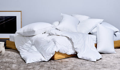
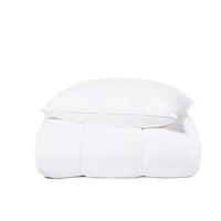
To be honest, this house was totally empty nine months ago. And since it was a clean slate, I’ve been incredibly careful in how I furnish it. I’m not simply taking stuff out of my old house and moving it in – instead, every single thing here was purchased specifically for the pace, to keep in line with the idea of creating this Scandinavian Barn. As a result, every room is partly empty, empty on purpose, because I refuse to fill it up with stuff.

That sounds like a lot of pressure on every item in the house – each piece had to serve a purpose and stand on its own.
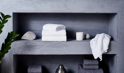
Right, and no hiding, either. There are no closets in the house – just open shelving, even for clothing. It’s not meant to a place where I keep a lot of stuff. I wanted to keep things so light, it would almost be like camping in a lovely house.

I don’t know that I get camping vibes from the kitchen, but I do appreciate the open shelving there, too.
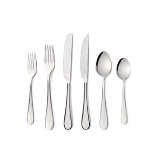
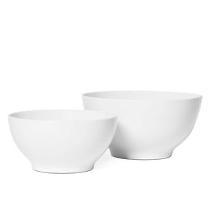
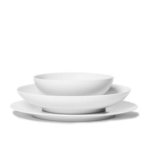
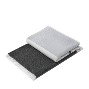
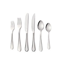
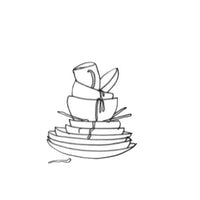
I’ve always been inspired by commercial kitchens, and how easy they are to use. Open shelving means you can grab plates with one hand while you’re cooking – that’s what I’m after. So it made sense to bring in Snowe dishware. I want one set of plates, not two or three with different patterns. I wanted all white, really durable, crisp and clean, like the pieces you’d find at a fancy restaurant. Same goes for the silverware – I wanted pieces that were highly functional, well-made, and would go with everything.

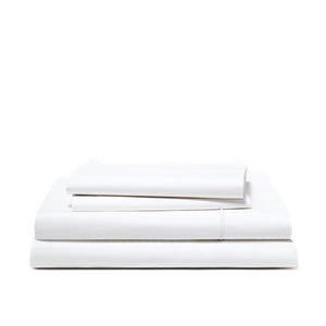
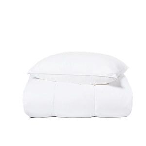
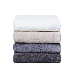
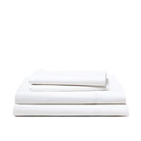
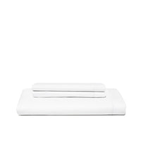
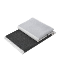
You also have your bed made up with our Sateen sheets.
I’m a big fan of your Sateen. It’s funny, years ago, when I was testing products for the site, a brand sent me Sateen sheets that felt very froufy – I knew immediately it was not for me. But Snowe’s Sateen has changed my mind. It’s so comfortable, warm, and cozy – honestly, Sateen is almost a misnomer. They should just be called “cozy sheets.”

We’ll consider it. Meanwhile, how did you take our Essential White colorway and make it your own?
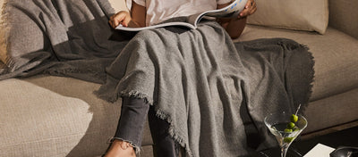
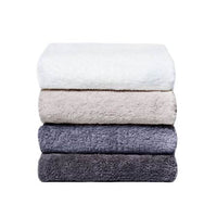
Snowe’s aesthetic suited the house perfectly – clean, crisp, high-quality, white pieces. Then here’s my rule – 25% color is all you need. The rooms here are largely neutral, and relay on the beauty of natural materials like luscious Carrara marble or raw wood. The touches of color, they’re smaller than you might think you’d need to make such a big impression.

And how do you go about making those color choices?
I did something I’ve never done before with this house, I put it together, start to finish, all at once. And I’d do it again. It allowed me to paint a very specific picture of a home that combined the barns I grew up near on Long Island, with the traditional side of Scandinavian design. I knew from the start I wanted the house to be clean, light, and spare, with bold accents of color and contrast. No light pastels here – every moment of contrast had to be really dramatic.
Well, the results speak for themselves. It looks perfect. But I have to know: How it is actually living here?
I have a daughter, and this house was designed with her in mind. People may look at this and think it all looks delicate and clean, but to be honest, it’s all designed to get worn in. White is easy to clean, nothing’s precious, and it’s all set to age nicely. This is no adult bachelor pad showpiece – trust me, when this house is full of kids and friends, it’s a zoo. And it works really well as a zoo.
Keep your eyes on Apartment Therapy this month to see more of Maxwell’s home and some special giveaways, too.